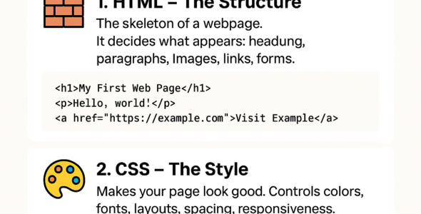
In this module, we'll explore the world of CSS media queries, which are used to apply different styles based on various device characteristics, such as screen size, orientation, and resolution. You'll learn about the syntax, examples, and best practices for using media queries to create responsive and adaptable web designs.

CSS Media Queries Syntax

The syntax for CSS media queries is as follows:

@media (condition) {
  /* styles */
}

The condition can be one of the following:

- width and height: Based on the viewport's width and height.
- orientation: Based on the viewport's orientation (portrait or landscape).
- resolution: Based on the device's resolution.
- device-width and device-height: Based on the device's width and height.

Examples

- Apply styles for screens with a minimum width of 768px:

@media (min-width: 768px) {
  /* styles */
}

- Apply styles for screens with a maximum width of 480px:

@media (max-width: 480px) {
  /* styles */
}

- Apply styles for portrait orientation:

@media (orientation: portrait) {
  /* styles */
}

- Apply styles for high-resolution devices:

@media (min-resolution: 2dppx) {
  /* styles */
}

Best Practices

Here are some best practices to keep in mind when working with CSS media queries:

- Use media queries to create responsive designs that adapt to different devices and screen sizes.
- Use the min-width and max-width conditions to target specific screen sizes.
- Use the orientation condition to target portrait or landscape orientations.
- Use the resolution condition to target high-resolution devices.
- Test your media queries in different browsers and devices to ensure compatibility.

By mastering CSS media queries, you'll be able to create web designs that are responsive, adaptable, and accessible to a wide range of devices and screen sizes. In the next module, we'll explore CSS frameworks and preprocessors in depth.

