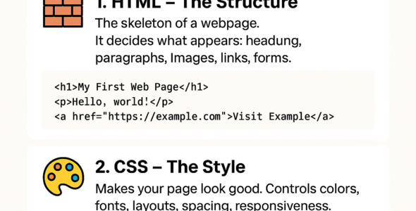
In this module, we'll apply advanced CSS concepts to build a complex and responsive web application. You'll learn how to integrate CSS with HTML and JavaScript to create a dynamic and interactive user interface.

Advanced CSS Project

- Responsive Design: Create a responsive design that adapts to different screen sizes and devices.

Syntax: @media (max-width: 768px) { ... }

Example: @media (max-width: 768px) { .container { width: 100%; } }

- CSS Grid: Use CSS Grid to create a complex and responsive layout.

Syntax: grid-template-columns: <grid-template-columns>;

Example: grid-template-columns: repeat(3, 1fr);

- CSS Animations: Create complex animations using CSS keyframes.

Syntax: @keyframes <animation-name> { ... }

Example: @keyframes spin { 0% { transform: rotate(0deg); } 100% { transform: rotate(360deg); } }

- JavaScript Integration: Integrate CSS with JavaScript to create dynamic effects.

Syntax: element.style.<property> = <value>;

Example: document.getElementById('myElement').style.backgroundColor = 'red';

- Accessibility: Ensure the project is accessible by following Web Content Accessibility Guidelines (WCAG 2.1).

Syntax: alt=<alt-text>;

Example: <img src="image.jpg" alt="Descriptive text">

Examples

- Responsive design:

@media (max-width: 768px) {
  .container {
    width: 100%;
  }
}

- CSS Grid layout:

.grid-container {
  display: grid;
  grid-template-columns: repeat(3, 1fr);
  grid-gap: 10px;
}

- CSS animation:

@keyframes spin {
  0% {
    transform: rotate(0deg);
  }
  100% {
    transform: rotate(360deg);
  }
}

- JavaScript integration:

document.getElementById('myElement').style.backgroundColor = 'red';

- Accessibility:

<img src="image.jpg" alt="Descriptive text">

Best Practices

- Use responsive design to adapt to different screen sizes and devices.
- Use CSS Grid to create complex and responsive layouts.
- Create complex animations using CSS keyframes.
- Integrate CSS with JavaScript to create dynamic effects.
- Ensure accessibility by following Web Content Accessibility Guidelines (WCAG 2.1).
- Test the project on different browsers, devices, and screen readers.

By completing this advanced CSS project, you'll demonstrate your mastery of CSS concepts and your ability to build complex and responsive web applications.

